
Artemis is a postpartum app designed to address what no one tells you about motherhood—the questions, uncertainties, and moments of doubt that arise, often in the dead of night. For the mother nursing at 3 a.m., wondering “Is this normal?”, Artemis provides trustworthy information, a safe community, and support grounded in science and lived experience.
Brand Vision
Artemis aims to transform global healthcare systems by valuing and empowering new mothers and parents. It seeks to teach the world the importance of supporting those raising the next generation, offering inclusivity for all parents—stepmothers, aunts, fathers, and others—while honoring the unique female experience.
With its guiding ethos of empathy, inclusivity, and empowerment, Artemis embraces the complexities of parenthood, providing a reliable and nurturing tool for navigating one of life’s most profound transitions.

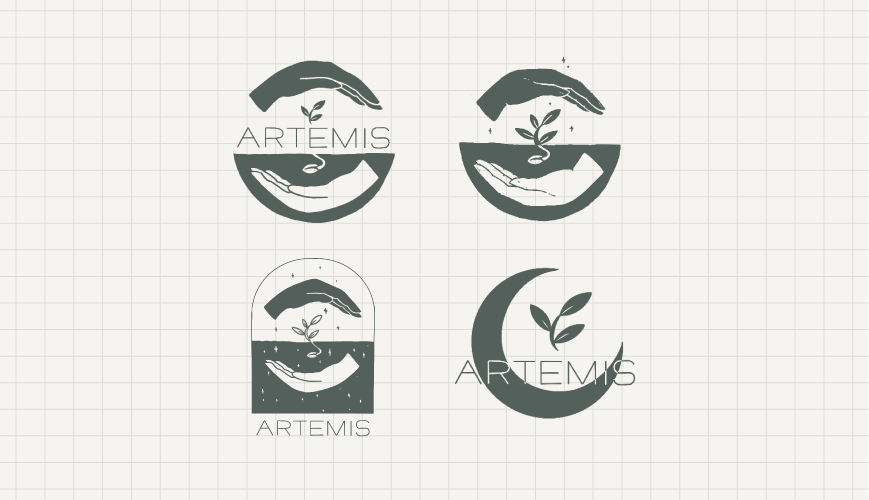
Logo & Symbolism
The Artemis logo embodies the app’s nurturing and empowering spirit through key symbolic elements:
Gentle Hands: Represent nurturing, care, and the support mothers need during postpartum. The hands also signify connection, strength, and the resilience required to navigate motherhood.
Seedling: A symbol of growth, new beginnings, and the cycle of life, emphasizing motherhood’s nurturing aspects while connecting with the concept of early stages and renewal.
Night and Day: The logo subtly references the duality of night and day, echoing the reality of motherhood—24/7 care and love. This symbolizes the app’s constant presence, offering guidance and comfort no matter the time.
Typography
Artemis employs clean and professional typography, balancing warmth and trustworthiness. The typeface reflects scientific authority without feeling clinical or overly minimalistic, making it approachable yet reliable. A future concept might allow users to select different aesthetic settings to suit their preferences, such as a calming or scientific mode for personalized interaction.
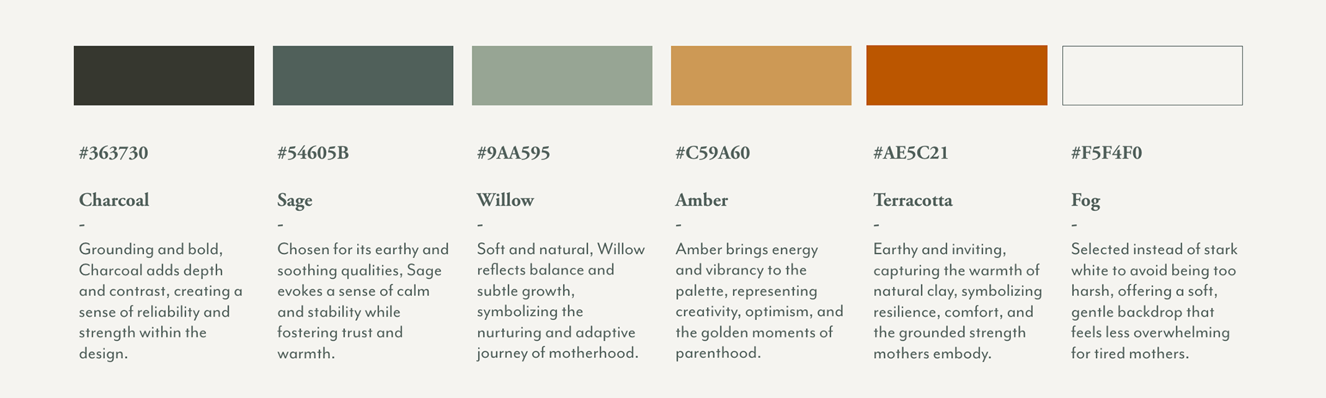
Color Palette
The Artemis palette emphasizes earthy, warm tones designed to feel calming, grounded, and inclusive. Each color has been chosen with intention, contributing to the app’s elevated and approachable aesthetic:
Personality & Experience
Artemis balances elevated design with an approachable, inclusive personality. The app avoids stereotypical gender associations, creating a welcoming space for all parents while honoring the female experience. Its personality is warm, intuitive, and empowering, making the journey through postpartum feel supported and manageable.
Key Attributes:
- Trustworthy and elevated without feeling overwhelming
- Warm and intuitive to navigate
- Grounded in science but deeply empathetic
Looking Ahead
Artemis is more than an app—it’s a movement toward better postpartum care, more informed parents, and stronger communities. As a woman-owned initiative led by diverse voices, Artemis strives to redefine the postpartum experience, empowering parents to embrace their unique journeys.
**stay tuned, there is more to come!**